
Piktochart is an excellent online website (also available on the App Store) which makes it really easy to create an infographic.

An infographic is a way of displaying data in a visual way. Text is combined with images and symbols to make the message the infographic conveys, easy to understand.
How do you use Piktochart?
It is a really easy, user-friendly program. Watch my video tutorial to see how it works:
How can it be used in class?
My pupils are learning about World War 2 at the moment, so I asked them to make an infographic on this topic. First I gave them a quick tutorial on how to use the website.

They then picked a specific area i.e. The Blitz and found a good website for facts. After, they created their infographics. Have a look at some of the final pieces:
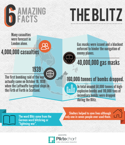
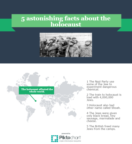
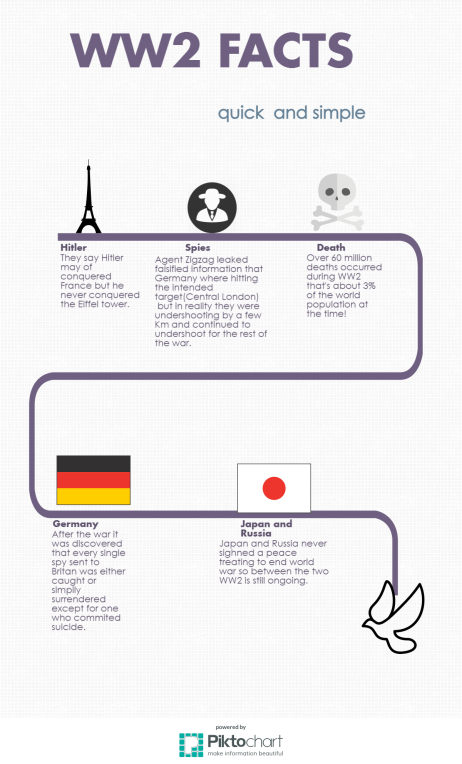
My students really enjoyed the lesson and it really made them think about different ways of presenting information. In addition, the program made learning really engaging for ALL of students – some of the infographics above were made by students who have English as a second language.
Have you used Piktochart? Let me know your thoughts by commenting below.


Thanks for sharing! This looks great! So simple to use but the results look so professional! I want to try this with my students immediately! I’ll share the results with you!
Thanks again,
Adam
LikeLiked by 1 person
Thanks Adam! Yes, let me know how you get on ☺
LikeLiked by 1 person